Table of Contents
Plan the key kitchen details before building new or remodeling.
Whether you are building a new home or remodeling an existing kitchen, the surface material should not be treated as a final detail. It can define the focal point, guide the color palette, and shape how the kitchen feels after installation.
This is where the Dual-Tone rule becomes practical. By combining two balanced colors with VinaQuartz Printed Quartz Slab, designers and importers can create a kitchen that looks intentional, premium, and easier to use every day.
Kitchen Renovation Checklist: Build Visual Impact with Dual-Tone Design
Before choosing each material separately, plan the kitchen as one connected design system. This checklist shows how VinaQuartz Printed Quartz Slab can support Dual-Tone design with both visual impact and daily function.
🗹 Start with one clear focal point.
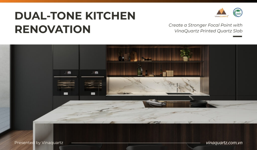
A kitchen should not have too many strong elements competing at once. Choose one main area to stand out, such as the island, countertop, or backsplash. A well-selected VinaQuartz Printed Quartz Slab can become the visual anchor for the whole kitchen.
🗹 Apply the Dual-Tone rule.
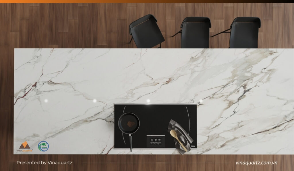
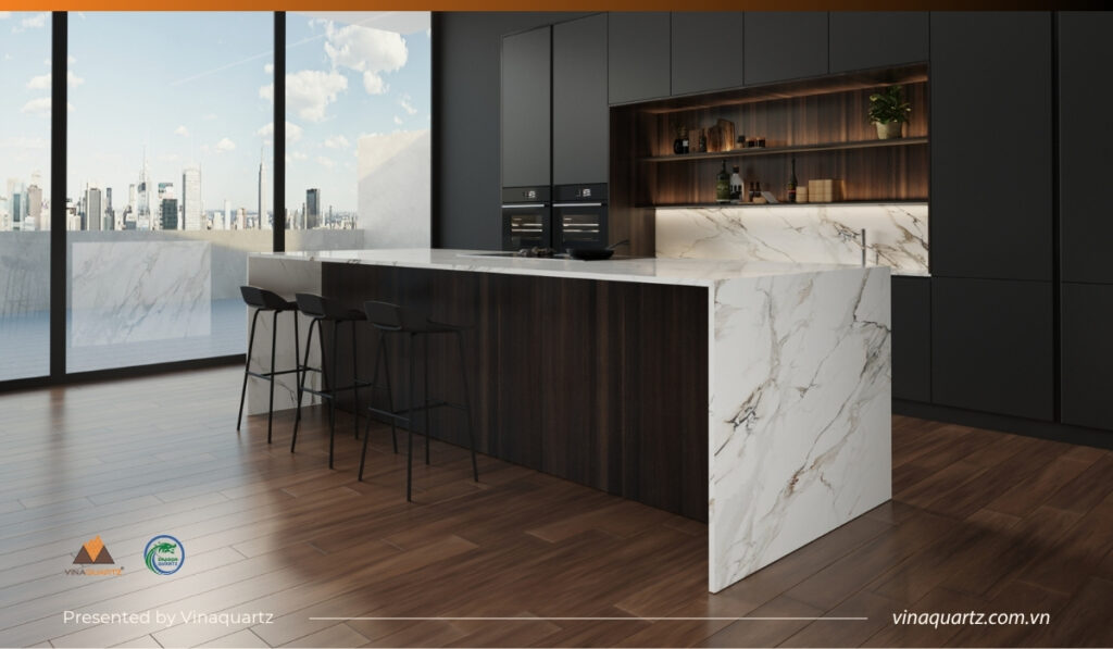
Dual-Tone means using two main colors. One color works as the base, while the other adds contrast, warmth, or depth. For example, soft white printed quartz can pair with natural wood cabinets, while a bold veined island can work with dark grey or matte black cabinetry.
🗹 Place Printed Quartz Slab where it matters most.
Not every surface needs to be decorative. Use Printed Quartz Slab in highly visible areas such as the island, main countertop, or backsplash. This helps the kitchen look refined without becoming visually crowded.
🗹 Make the backsplash part of the design.
A backsplash protects the wall from water, oil, and cooking stains, but it can also shape the kitchen’s visual identity. A quartz backsplash creates a cleaner, more continuous look when it connects with the countertop and supports the Dual-Tone concept.
🗹 Choose cabinet colors that support the quartz pattern.
Cabinet colors should enhance the quartz surface, not compete with it. If the slab has bold veining, simple cabinet tones usually create a cleaner result. If the slab design is soft and neutral, darker cabinets can add structure and contrast.
🗹 Plan lighting before judging the final look.
Lighting can change how quartz appears in real use. A single ceiling light may leave shadows and reduce pattern depth. Under-cabinet lighting, island pendants, and soft ambient lighting can reveal the tone of VinaQuartz Printed Quartz Slab more clearly.
🗹 Check slab layout and vein direction.
For importers and project buyers, the final result depends on more than color selection. Slab size, vein direction, edge details, cutouts, and installation layout all affect how the kitchen looks after fabrication, especially with waterfall islands, large countertops, and continuous backsplashes.
🗹 Connect beauty with practical performance.
A kitchen surface must look premium, but it also needs to support real use. The right quartz surface should fit the design style, project requirements, and daily needs of the end user. VinaQuartz Printed Quartz Slab can support projects that require both visual value and practical interior application.
Avoid the Failure: Choose the Right VinaQuartz Printed Quartz Slab Collection
A successful kitchen renovation should create a clearer direction, stronger focal point, and better daily living experience.
With the Dual-Tone rule, VinaQuartz Printed Quartz Slab can connect the island, countertop, backsplash, cabinetry, and lighting into one complete kitchen concept. For importers, designers, and project buyers, this creates a stronger product story and a more convincing way to present premium quartz surfaces.
View the VinaQuartz Printed Quartz Slab Collection and select the right surface for your next renovation, showroom, or interior project.